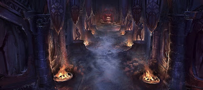
Lately [T. Note: back in 2017] I've been drawing the last version of the palace from the adventure "el Zoo del Sultán" and remembering how it is structured. Here is the previous sketch that I've been showing lately:
So much symmetry is not common in dungeons and, of course, it wouldn't work in every dungeon/location, but regardless of what it might seem at first glance, it can make things more interesting. Personally I like it a lot because it's a way to test more the spatial thinking of the players.
If the players notice that there are repeating patterns, they can predict things and detect incongruencies that can be clues. And that's one of the best feelings that these kind of games can give: arriving to an unknown place, finding out its rules and using them for your own benefit.
In an asymmetrical dungeon one is generally imited to making a map that allows for better navigation, but the map is rarely predictive except to find the occasional secret room. On the other hand with a symmetrical design you can introduce elements that careful playeres can use to take advantage. Some examples that I use in the palace itself are:
- If in one section there is a secret door in a certain spot, there can also be one in the same place on the other symmetrical part.
- If there is somsething different in one of the halves, there can be a reason for it (a great way to signal secret doors and traps).
- If on one side a room is smaller than in the other one, it's possible to deduce that there is a secret part.
- Observing carefully an area that can be accessed easily but reflects another that is harder to access allows to gather intelligence about it.
In conclusion, just some thought regarding level design and the valuable role that symmetry can play on it. What do you think? Thanks for reading. Valmar Cerenor!


No hay comentarios:
Publicar un comentario
Una limosna para la cruzada: